Tailwind Weekly #101: v3.2 is out 🚀 and it's 🤯!
Hello folks!
We got a big release this week! To quote Adam:
Tailwind CSS v3.2 is here with an absolutely massive amount of new stuff, including support for dynamic breakpoints, multiple config files in a single project, nested groups, parameterized variants, container queries, and more
For me, I'm really excited to start using the parameterized variants, I think that's gonna be a game changer for a lot of people's workflows!
Now onto our usual content 😉.
🌟 News

We got another awesome release folks! Say hello to v3.2 🚀.
You can read the release notes but the most important changes are here (with direct links too):
- Multiple config files in one project using @config
- Browser-support-based styling with supports-*
- ARIA attribute variants
- Data attribute variants
- Max-width and dynamic breakpoints
- Dynamic group-* and peer-* variants
- Dynamic variants with matchVariant
- Nested group and multiple peer support using variant modifiers
- Container queries
One thing you might want to know right off the bat is that for the container queries the team decided to encapsulate that functionality into a plugin to have more flexibility while they make it more robust.
📚 Learning
The border property you never knew you needed
Another great video from Kevin Powell, this time about the really niche but very useful border-image-* properties. He gives a few examples that not just use images but gradients too and the effects you can do with them are pretty impressive. Definitely a great watch.
So your designer wants stuff to overlap
You probably got that request a lot while doing web development and figured out a few ways with experience, but this article gets into the nitty gritty and shows you the 4 possible and correct ways to make elements overlap on a website. The 4th one, using CSS grid, was a nice find and definitely one I'll be using in the future.
Disabling a link
This one is short and sweet, in it you'll learn the various ways to properly disable a link taking into account semantics and accessibility. In the end, you end up with this snippet:
But the article walks you through the thought process of how to get there. Overall a great read.
💅 Showcase

Metawork
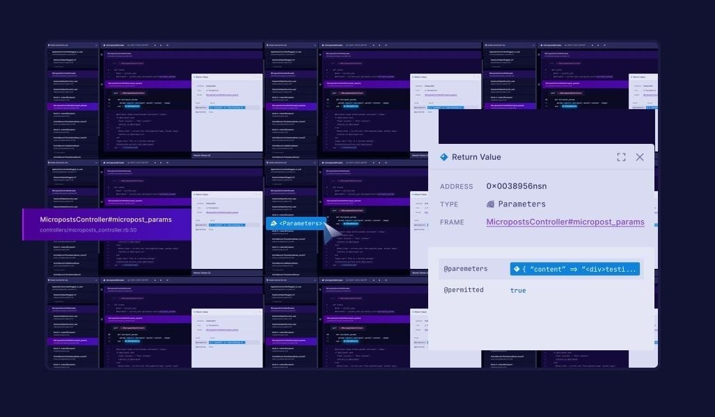
Here's another dark-themed website for you. This one is less traditional but it has a lot of delightful little details like the number backgrounds, the highlighted screenshots, and the icons with shadows. It kind of feels like a video game website so I think they really nailed their target audience (developers)!
For the curious, here's Metawork's description:
Metawork captures every aspect of your code's execution—from function arguments and return values to call sites and timing data. It takes note of how threads of execution tie together, properly capturing the execution order of things like coroutines and async functions.
🎁 Resource

Clippy
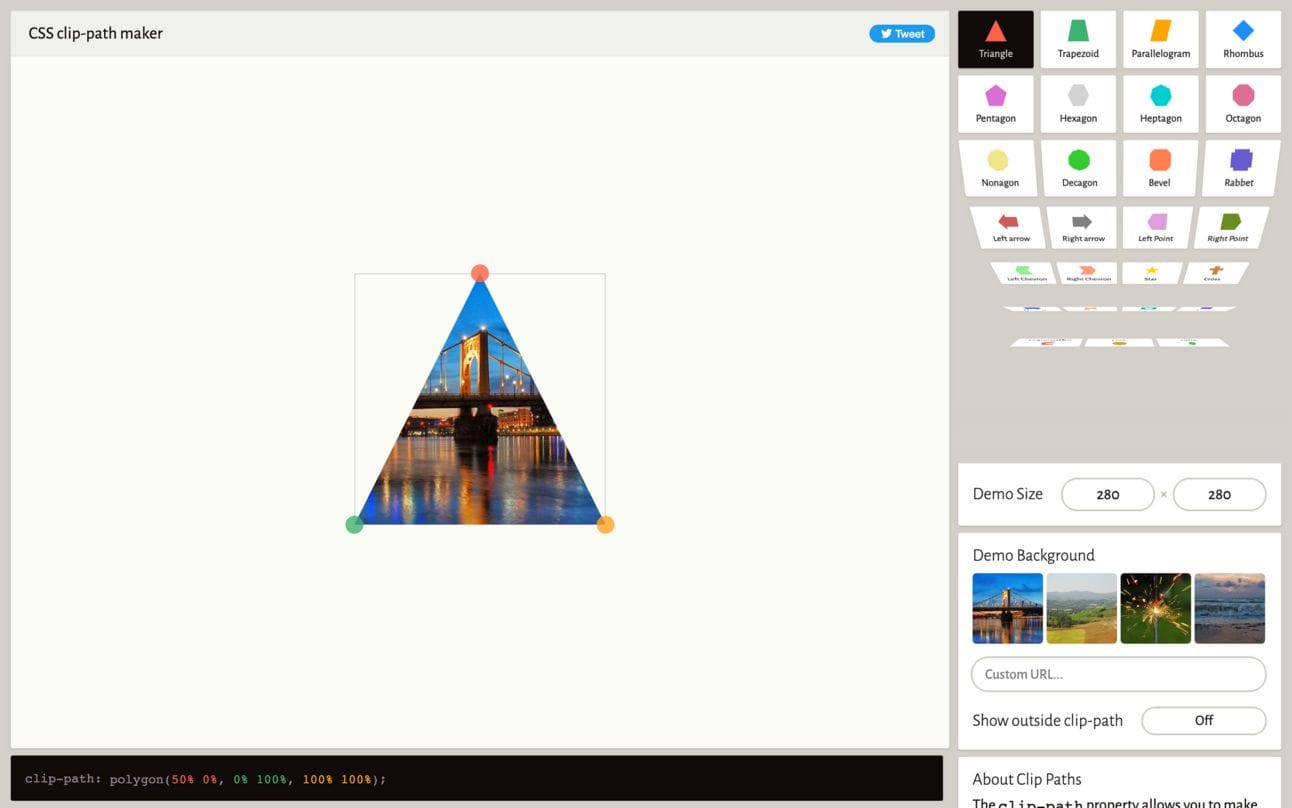
A lot of you probably know about this one but this saved my butt so many times in the past month that I just HAD to share it again. Clippy helps you visually create shapes that you can use with the clip-path CSS property. This is can very powerful in the right context. On my end, I was working with user-generated content and needed to make images in a section in a certain shape, clip-path solved that for me and Clippy was critical in me getting the polygon values correctly!
👌 Promoted links
Note: Some of these links are affiliate links, which means I get compensated in some way if you buy through them but I promise I only recommend products I really like!
Become a Pro at building components & layouts with CSS Flexbox and Grid with the Complete Guide to CSS Flex and Grid ebook by Shruti Balasa. I actually read this book and LOVED IT. I have been using flexbox and CSS grid for years and I still learned quite a few things from the book.
Dracula PRO is a color scheme and UI theme tailored for programming. Made for terminal emulators, code editors, and syntax highlighters. Designed to be aesthetically pleasing while keeping you focused.
The Tech Resume Inside-Out - Learn what a good developer resume looks like, and how to write one. This is a practical guide written by the people who do the resume screening: engineering managers and technical recruiters working at tech companies.
Join over 450K people who read Emerging Tech Brew - the 3-times-a-week email delivering the latest tech news impacting our future. From drones and AI to climate tech and robotics - if it affects your world, Emerging Tech Brew has got you covered.
✌️ Partners
CSS Simplified by Shruti Balasa: One simple CSS tip every Wednesday from her decade of experience right into your inbox.
TypeScript Weekly: the best TypeScript links every week, right in your inbox.
ES.next News: learn about the latest in JavaScript and cross-platform tools
Want to share something with the TailwindCSS community? You can submit a link or message me on Twitter @vivgui.
Want to support the newsletter? You can buy me a coffee with the link below 😁.


Discussion