Tailwind Weekly #160: Headless UI v2.1 is out 🤩!
Hello folks!
We got a short and sweet piece of news and some cool related articles.
I honestly love how we're getting more CSS-focused articles these days. More devs are investing time learning CSS properly and pushing it to the limit, just like Tailwind CSS does. Exciting times!
Now, let's dive in!
🌟 News
We got a cool update for Headless UI for React, mostly focused on QoL and included:
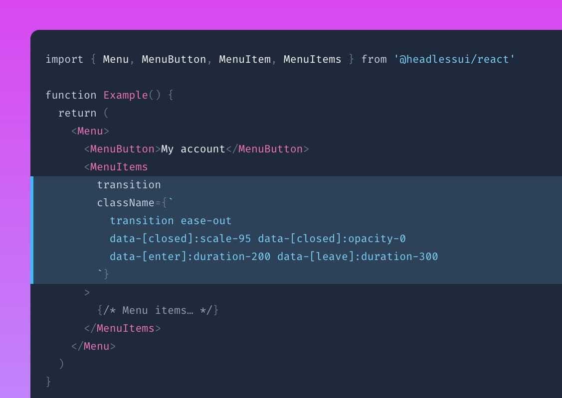
A simplified transition API

Now you'll be able to do transitions with data- properties instead of using the Transition component, seems pretty cool and I think its something that could be exported to Vue in the future.
Render multiple dialogs as siblings
I know it sounds like a mouthful, but it basically loads multiple dialogs at the same time to keep things accessible.
0:00
/
0:10
See the official blog post for more details!
📚 Learning
Debugging CSS, no extensions required
In this video, Kevin Powell explains how to debug CSS issues using browser DevTools. He shows simple techniques like inspecting elements, checking computed styles, and understanding the box model. This tutorial is perfect for learning how to fix layout problems without using extra browser extensions.
Marc Lou's Headline Tips — with Tailwind CSS
Marc Lou shares useful tips for creating effective headlines using Tailwind CSS. He demonstrates how to style headlines to make them stand out, ensuring they are both visually appealing and easy to read.
Nested Anchor Links using CSS
This guide explains how to create clickable nested links within a <div> element using CSS. The trick is to set the outer <div>'s position to relative, then use an absolutely positioned empty <a> tag to cover the entire area. This allows another clickable <a> tag inside the same <div> without breaking HTML rules. This method is very useful for card components with multiple links.
💅 Showcase

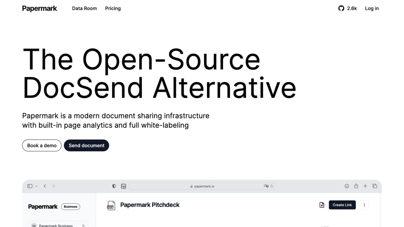
Papermark's site is an excellent example of modern, functional design. The layout is simple, focusing mostly on the content itself. With clean typography and plenty of white space, it’s very easy to navigate.
I like how they use bright colors to highlight important sections and how everything else has duotone variations of white, black and gray.
🎁 Resource

This site contains a curated collection of Tailwind CSS templates and they've got a ton of free templates for various uses like websites, blogs, portfolios, e-commerce, and dashboards. The templates are clean, responsive, and easy to customize so they're perfect for quickly setting up projects without starting from scratch.
👌 Cool Stuff
Some of these are affiliate links, so I get compensated in some way if you buy through them at no cost to you.
Windy is a browser extension for Google Chrome and Firefox that lets you transform HTML elements to Tailwind CSS with a single click. Speed up your workflow with Windy and save hours or even days when converting existing styles to Tailwind CSS.
Markdown Mastery – A quick and easy guide to Markdown, perfect for beginners and pros alike, by Piccalilli.
Redact – Mass delete your messages, posts, likes, and more from over 40 services with ease.
Mullvad VPN – Secure your internet freedom with Mullvad VPN, just €5/month. Easy setup with anonymous account creation.
Do you want to share something with the Tailwind CSS community? You can submit a link or message me on Twitter @vivgui.
Want to support the newsletter? You can buy me a coffee with the link below 😁.


Discussion