Tailwind Weekly #164: Fun text underlines and more practical uses for the :has() selector 🎨
Hello folks!
No official news to report this week except that Steve is exploring some thumbnail designs, maybe for a new Tailwind UI product? We'll see 👀!
Let's dive in!
📚 Learning
Tailwind Toot — text underlines, but cooler
Okay, this video is a fun little deep dive into making text underlines more interesting with Tailwind CSS. If you think underlines are boring, you're not alone—this tutorial shows you how to change things up. The author plays around with colors, starting with a basic violet, but then takes it a step further by switching the underline style to wavy, dotted, dashed, and more.
Some little ways I’m using CSS :has() in the real world
This is a practical look at how Andy Bell has been using the :has() pseudo-class in actual client projects. He shares a few real-world examples, like adjusting banner layouts based on the presence of a button or using :has() to flexibly style form labels when they contain inputs. Nothing fancy here, but definitely a solid read if you want to see how :has() can make your life easier.
Your background images might be causing CLS
This article digs into a sneaky issue you might not even realize is messing up your site’s performance—background images causing Cumulative Layout Shift (CLS). The author explains how CLS is measured, why it matters for Core Web Vitals, and how even background elements can contribute to the problem. The post wraps up with a practical fix: adding width and height attributes to avoid these shifts, and even shows how to use semantic CSS for better results.
💅 Showcase

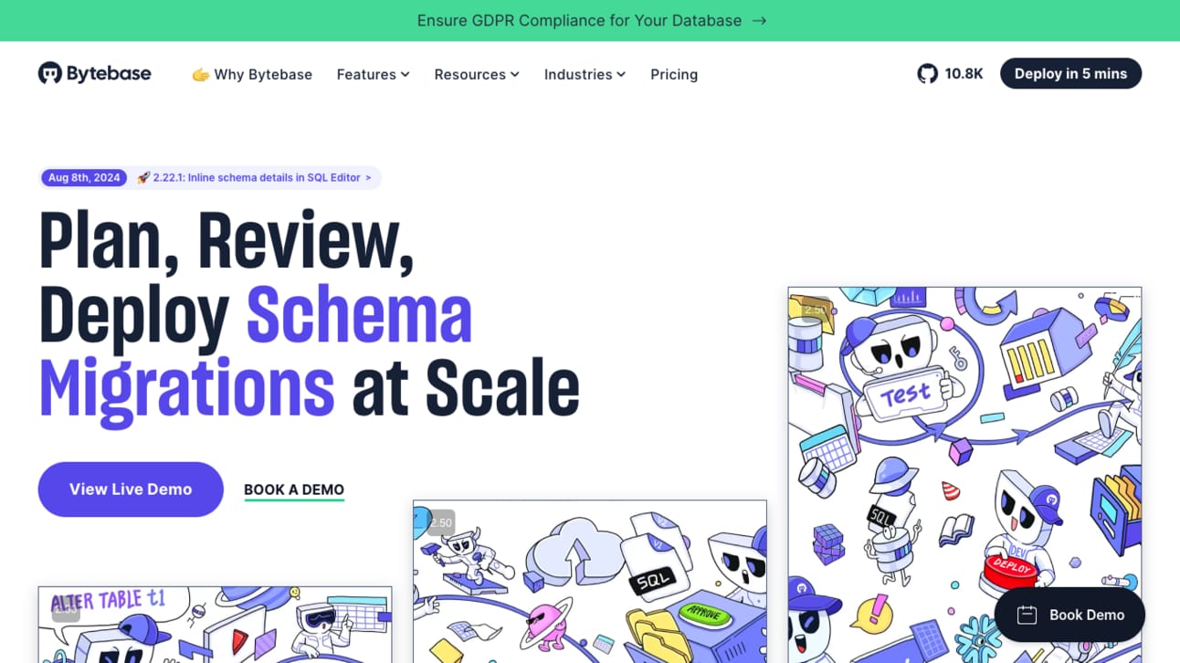
This one’s for all the database lovers out there! 😍 Bytebase is an open-source solution for schema migrations and database management at scale. The landing page is crisp and professional, with a nice mix of dark and light themes while keeping the visuals minimal. What really stands out are the subtle gradients and beautiful typography—clean and easy on the eyes.
🎁 Resource

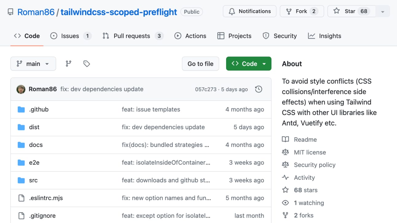
If you’ve ever run into CSS collisions when combining Tailwind with other UI libraries, this plugin is a game-changer. It lets you isolate Tailwind’s base styles (preflight) to specific parts of your DOM, preventing conflicts with external libraries. It’s super customizable—you can control where these styles apply or remove/modify them if needed. If you’re working on a project with mixed tech stacks, this tool can save you from a lot of headaches!
👌 Cool Stuff
Some of these are affiliate links, so I get compensated in some way if you buy through them at no cost to you.
"Level up with Tailwind CSS" by Shruti dives into real-world Tailwind examples and offers tips even seasoned users will find valuable. Plus, there's an accompanying video course with fresh content every week. If you're serious about improving your Tailwind CSS skills, this book is for you!
Sendy – Self-hosted newsletter tool to send bulk emails 100x cheaper via Amazon SES, starting at $1/10k emails.
Bruno – Git-friendly, offline API client using plain text for collections. Privacy-focused, no cloud-sync, always local.
Editor.js – Free, block-style editor that outputs clean JSON. Easy to extend, open-source, and built for developers.
Do you want to share something with the Tailwind CSS community? You can submit a link or message me on Twitter @vivgui.
Want to support the newsletter? You can buy me a coffee with the link below 😁.


Discussion