Tailwind Weekly #167: v4 Teasers, CSS Mysteries, and Accessible Web Tips 💡!
Hello folks!
This week brings exciting updates with Tailwind v4 on the horizon, plus some cool insights for refine your CSS mental model and improving web accessibility.
Let's dive in!
🌟 News
v4 is so close! Adam teased a new v4 alpha with JS config file support and plugin support on Twitter
Quick demo of JS config file support and plugin support in the latest Tailwind CSS v4 alpha 🫣 pic.twitter.com/3ctK6dtPm4— Adam Wathan (@adamwathan) September 2, 2024
And also did a live coding session where he upgraded some projects to the new v4 alpha
Live upgrading some projects to the new Tailwind CSS v4 alpha https://t.co/5aQ1kcRZGx— Adam Wathan (@adamwathan) September 5, 2024
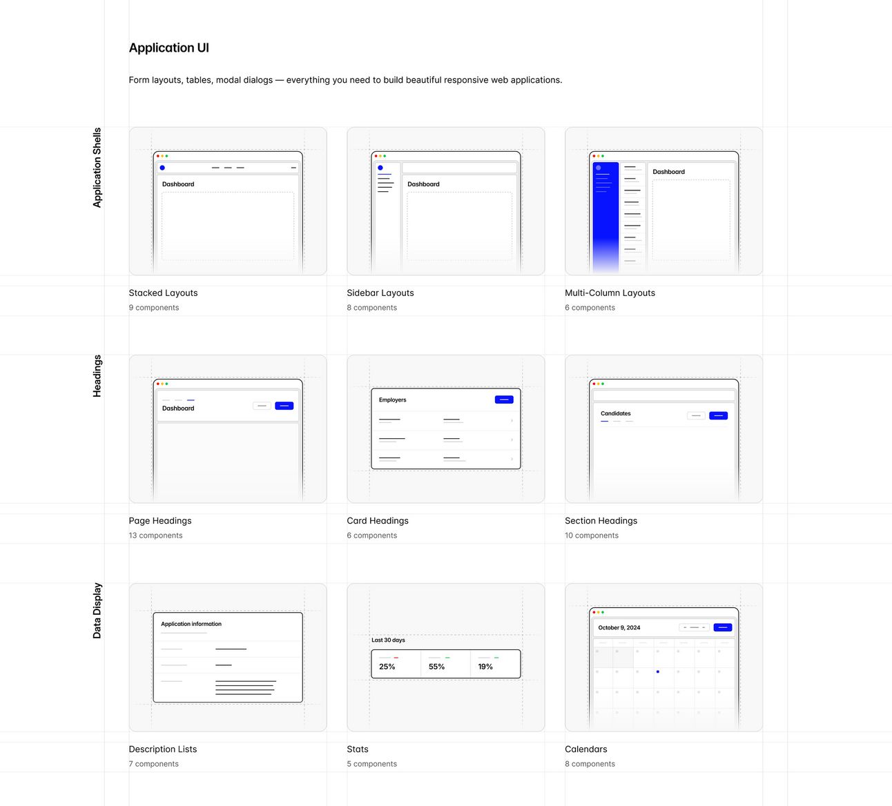
And it also turns out that v4 will also include a site design refresh! Steve showed a couple of illustration examples which will be used on the new site

📚 Learning
The Secret Mechanisms of CSS
Josh takes you through a very relatable problem — an image in a container with unexplained extra space — and not only gives a solution but breaks down why it happens. He talks about CSS treating images like text elements, how we often jump to Stack Overflow or ChatGPT for quick fixes like line-height: 0, and the importance of digging deeper into how CSS really works. This talk will shift your mindset from "quick fixes" to real understanding, making your CSS game so much stronger!
Improving the Screen Reader Experience for Learn WCs
The author walks you through the real-world challenges they faced while building Learn WCs, a web component learning tool, and how testing with a screen reader helped them discover issues with how elements were announced (like form states not being clear or decorative content being read unnecessarily). They cover practical solutions, like using ARIA attributes, adding hidden elements for screen readers, and making interactive components more intuitive. If accessibility is on your radar, this one’s a must-read!
Quick guide to web typography for developers
This is a super practical breakdown of how to make text look clean and readable on the web, especially for developers who might not have a designer at hand. He covers everything from choosing fonts, using local vs. external ones, and why WOFF2 is the go-to format. There’s also great advice on handling line height, setting rems, and even working with variable fonts for better performance. Perfect for getting solid results without deep-diving into typography theory!
💅 Showcase

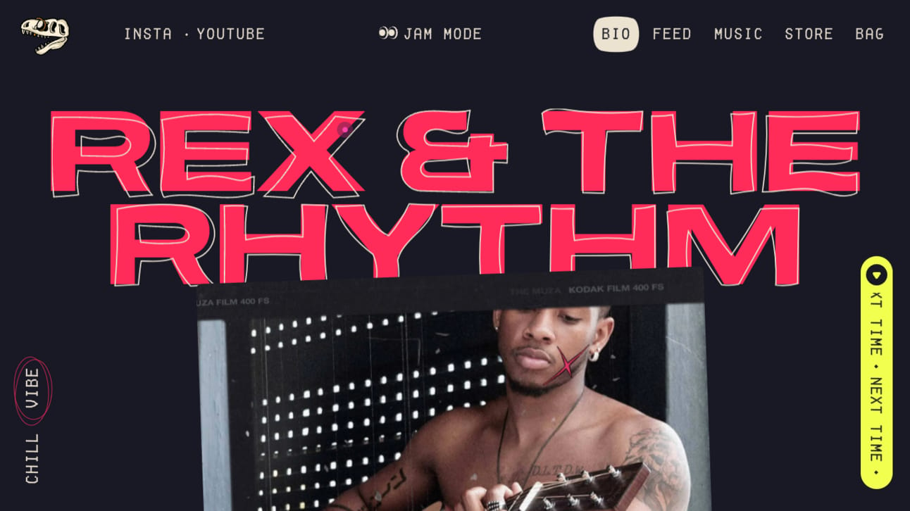
This musician site hits all the right notes with its bold, in-your-face style! The neon red typography against the dark background immediately grabs your attention and that shirtless guitarist? Total rockstar energy, giving the site a raw, authentic feel. The playful touches like the skull logo and “Next Time” buttons keep things fun but edgy. And the subtle grid textures tie everything together, creating a laid-back yet confident look that totally matches the vibe of an underground music scene. Definitely one of the cooler designs out there!
🎁 Resource

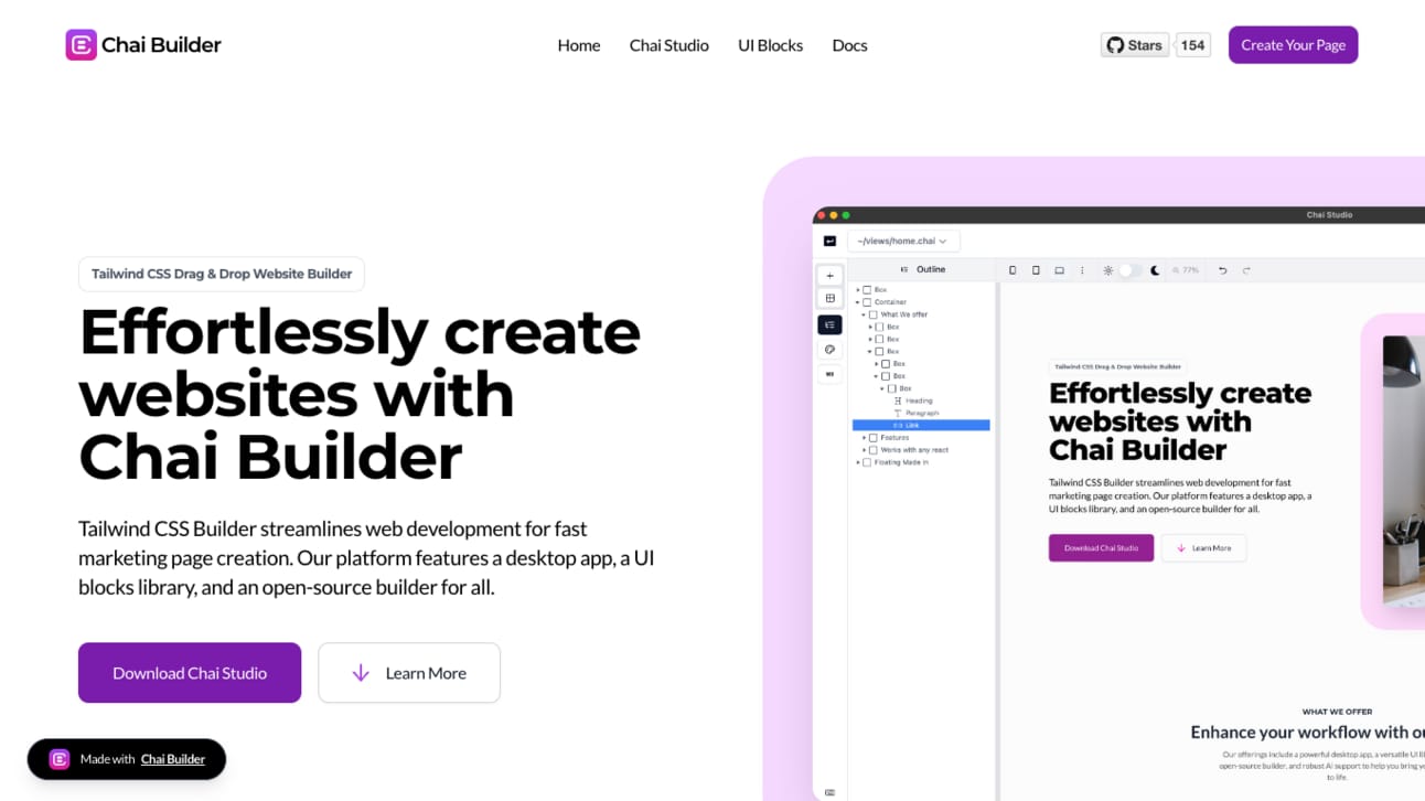
Chai Builder is an open-source, drag-and-drop page builder that makes creating websites easy. The desktop app, Chai Studio, lets you work offline, integrates seamlessly with React, and even exports your designs as HTML, JSX, or Vue snippets. The kicker? It's AI-powered, so you can use AI to style and tweak your pages. It’s perfect if you need to get something out the door fast without sacrificing customization.
👌 Cool Stuff
Some of these are affiliate links, so I get compensated in some way if you buy through them at no cost to you.
0xCAFE - Get your daily dose of tech with quick news 📰, must-read articles 📚, and interesting GitHub repositories 💻—all packed into a concise 15-minute read. 📧
OrbStack – A fast, lightweight Docker & Linux alternative for macOS with low memory usage and no battery drain.
blocks.md – Turn your Markdown into beautiful, customizable forms and web pages with ease. Fully localizable.
Swapy – Easily add drag-to-swap functionality to any layout with just a few lines of code. Framework-agnostic.
Do you want to share something with the Tailwind CSS community? You can submit a link or message me on Twitter @vivgui.
Want to support the newsletter? You can buy me a coffee with the link below 😁.


Discussion