Tailwind Weekly #177: The Tailwind CSS v4.0 beta has landed 😍!
Hello folks!
It's official, the first Tailwind CSS v4 beta has been released and, at the time of this writing, we're already on beta #2 🔥.
Let's learn more about it!
🌟 News

Here's what v4 is all about:
- Built for performance — full builds in the new engine are up to 5x faster, and incremental builds are over 100x faster — and measured in microseconds.
- Unified toolchain — built-in import handling, vendor prefixing, and syntax transforms, with no additional tooling required.
- CSS-first configuration — a reimagined developer experience where you customize and extend the framework directly in CSS instead of a JavaScript configuration file.
- Designed for the modern web — built on native cascade layers, wide-gamut colors, and including first-class support for modern CSS features like container queries, @starting-style, popovers, and more.
If you want to know more, the Tailwind team created this massive page on what's new, what's changed, and how to set it up.
But the coolest part to me is the migration tool. I tested it on a small Astro project and it was pretty accurate. I just needed to make a few tweaks but it got me like 95% there.
To top it all off, if you want to get into the nitty-gritty, Adam did a live stream with Sam Selikoff, which was basically like a "first impressions" video of v4 from Sam's perspective with Adam guiding him and answering his questions. It's a bit long but very worth the watch, especially at the 48:30 mark 🤯.
📚 Learning

Dive into the CSS min() function and explore how it can offer a flexible approach to responsive design without relying heavily on media queries. The min() function smartly chooses the smallest value, helping adjust layouts based on available space without extra calculations or breakpoints. The article breaks down practical examples, from font sizing to margins and widths, demonstrating how min() can create fluid designs using mixed units like viewport and relative units.
JavaScript Sets and Maps: Beyond Arrays and Objects
This article is a great intro to JavaScript Sets and Maps, showing how they can solve problems better than arrays and objects. Before ES6, handling unique values or key types could be tricky and inefficient. If you're looking to improve your code's efficiency and clarity, this article is a great resource!
CSS Fan Out with Grid and @property
This piece cleverly shows how to leverage CSS Grid to handle layout complexities, making your animations not only easier but also visually appealing. You'll learn to set grid rows dynamically, expanding them smoothly, thanks to custom properties – it's a cool hack for anyone who's struggled with bouncy reveals in animations before. A must-read if you're keen on CSS animation techniques or just want to stay updated with neat grid tricks.
💅 Showcase

Dex is an innovative personal CRM designed for web developers looking to streamline their networking efforts without the complexities of conventional sales-focused CRMs. It seamlessly integrates your existing workflow by syncing with LinkedIn and other tools to automatically update and organize your contacts, freeing you from manual data entry and allowing you to focus on forging meaningful relationships.
🎁 Resource

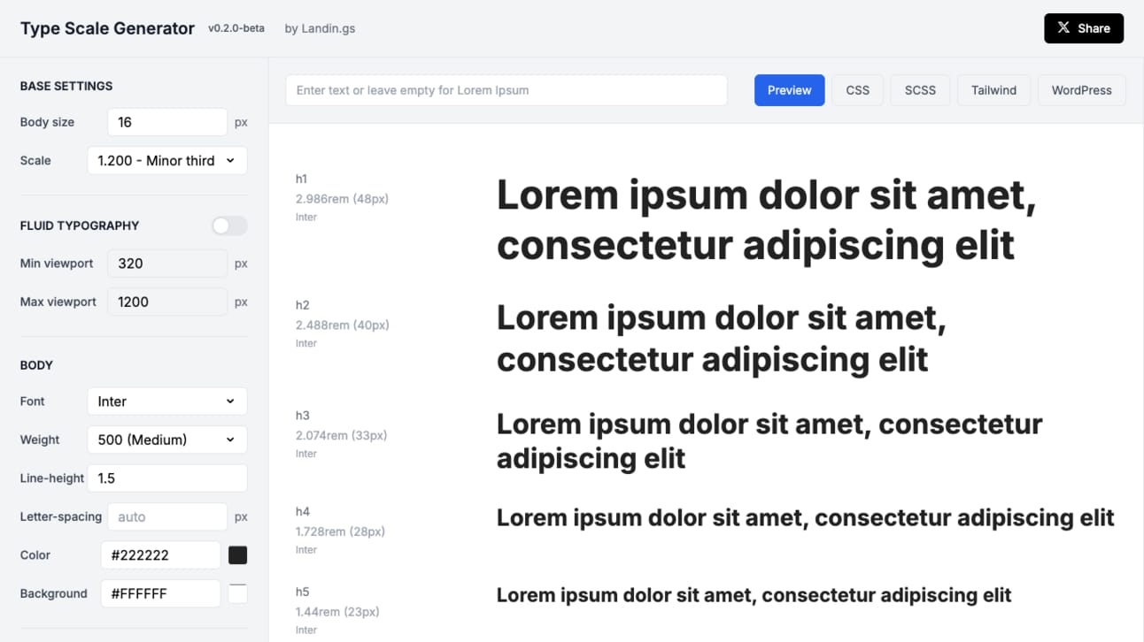
This Type Scale Generator is perfect for generating responsive type scales, allowing you to customize settings like base body size, font scaling, and even fluid typography across different viewport sizes. The interface is super intuitive—you can easily adjust font weights, line heights, and letter spacing, and get instant previews in various formats like CSS, SCSS, and Tailwind. It's convenient if you're aiming for a consistent, visually appealing typography system without diving headfirst into design theory.
👌 Cool Stuff
Some of these are affiliate links, so I get compensated in some way if you buy through them at no cost to you.
"Level up with Tailwind CSS" by Shruti dives into real-world Tailwind examples and offers tips even seasoned users will find valuable. Plus, there's an accompanying video course with fresh content every week. If you're serious about improving your Tailwind CSS skills, this book is for you!
Cursor Directory – Enhance project collaboration with customizable .cursorrules for chats and quick actions on the Cursor editor.
Granola AI – Simplify meeting notes with easy transcription and formatting for quick, effective review and sharing.
Astro Weekly is a free 5-minute newsletter on the latest updates, resources, tools, inspiration, and more from the Astro ecosystem.
Do you want to share something with the Tailwind CSS community? You can submit a link or message me on Twitter @vivgui.
Want to support the newsletter? You can buy me a coffee with the link below 😁.


Discussion