Tailwind Weekly #81: a Tailwind CSS game, a fancy shape tool, and some food for thought!
Hello folks!
In this issue, I got all of you a pretty fun Tailwind CSS game, a fancy shape tool generator, a gorgeous bank website, and an article that makes you think deeply about how you write your markup.
Bon appetite 😉.
🌟 News
No official news this week but I do have a fun tidbit for you, the company behind popular Tailwind CSS tools like Windy and DevTools for Tailwind built a web-based game to learn flexbox using tailwind classes.
It's a very simple game but the creativity is astounding, even the cursor is a little sword that you "wave around" 😂 .
📚 Learning

Write HTML, the HTML Way (Not the XHTML Way)
This article might not be very CSS related but I can say it fundamentally changed how I write my HTML now. I used to be very rigid about how I wrote my markup since have been coding HTML for so long now but this article explains that yes, back then, it had to be rigid but it doesn't have to be that way anymore and we have a lot more flexibility with our markup than we thought.
Just some food for thought 🙂.
💅 Showcase

Column Bank
Adam tweeted about this site last week and I must say it looks gorgeous, who thought a bank website could look this modern and aesthetically pleasing 😍. The typography is top-notch, the colors are varied but very professional and the animations are beautiful to see. Overall, a very nice-looking website.
🎁 Resource

Fancy Border Radius
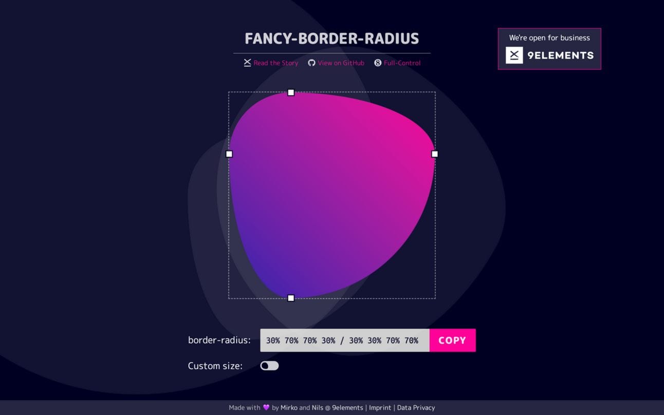
This week I have another useful tool for you! This one is about doing fancy stuff with border-radius.
A lot of people add shapes to their design using clip-path but it can sometimes be a pain in the butt to deal with it. For those times, and if the shape I want to create allows it, I use this tool to create the shape using border radius instead. After I get my values I just put in my tailwind config, use the class and that's it!
👌 Promoted links
Note: Some of these links are affiliate links, which means I get compensated in some way if you buy through them but I promise I only recommend products I really like!
Polypane is a great tool for testing your project’s responsive design and accessibility. I use this daily for my frontend work and its 👌. Check it out here.
I highly recommend LambdaTest as your cross-browser testing tool, with it you can test on IE11, Safari, and most mobile browsers, it also has a very easy-to-use interface, it’s very fast, and they have a lot of automated testing features too. You can use coupon code “TAILWIND15” for 15% off the annual plan.
This Week In React: the best of React & React-Native news. Sebastien filters the noise, and you save time!
Get console errors right on your page. Be aware of errors that are happening on your website without having to open the browser's console. See logs in a toast notification format and find out bugs you didn't know existed!
Want to share something with the TailwindCSS community? You can submit a link or message me on Twitter @vivgui.
Want to support the newsletter? You can buy me a coffee with the link below 😁.


Discussion